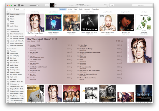
In my opinion, overall, this layout is simpler, it’s easier for people to find what they’re looking for. It comes at the expense of some sticking points, such as replacing the individual buttons for media selection with a drop down menu and some options being moved to the menu bar. But design, as life is a series of compromises. Visually, I slightly prefer the previous version, however this one is easier to navigate, thus addressing one of the key concerns of new users.